
As a part of my college project, I was asked to critically analyse my portfolio website, and apply feedback into my next project – Power City website.
My personal portfolio website was built using HTML5, CSS3 and Bootstrap and hosted by GitHub. It was my first life website and by learning new techniques and technologies I am hoping to improve it constantly. I found working with Bootstrap quite easy as it works similar to CSS grids (except specifying the number of columns), however, the grid can’t be reflected exactly 100% in Adobe Illustrator or Photoshop. Therefore, we will end up applying small changes in the layout during the production. Another thing I didn’t enjoy while coding with Bootstrap was the limitation by the number of columns. Of course, this could be overcome with additional margins, but at the end of the day, we don’t want to apply margins and paddings (sometimes negative) to every element in the code. Other than that, Bootstrap allowed me to easily implement code for Lightbox gallery, and other features which usually require knowledge of JavaScript or advanced CSS.
During one of our classes, I was lucky to get feedback from one of my classmates – Conor. You can find the whole interview below (sorry for the poor sound quality, as I mention, it was during the class).
Conor was able to easily identify that this was a portfolio website. He could explore the website without troubles through simple navigation and layout. He said, that information was clearly identified and easy to find however, it was missing call to actions, which in this case were clickable headings. He also said, that the flashing images could be very distractive and it would be nice to have social media icons instead of words, which can be found in the secondary navigation on the bottom left side. I found this feedback very helpful as it is difficult to criticise your own website, especially if it is a portfolio. Now, every employer has a creative background and for them, the most important thing is to find the information as easy as possible.
Analysing websites through Web Standards
The next thing I did was to check my website through Accessibility Web Standards. I found a few websites which emphasised errors and improvements in HTML. I run the diagnostics through W3C Markup Validation Service and The W3C CSS Validation Service. You can find the results below:


It is also a good practice to run it through different validators. I particularly recommend Wave as it highlights which parts of website require improvements:

Based on this feedback I will remember to consider these errors when developing my next website for Power City.
Researching for web standards I came across a very interesting article by Eva Ferreira “10 Guidelines to Improve Your Web Accessibility”. According to her list, I will evaluate my current design for Power City Website, and introduce any further improvements.
1. Do not depend (only) on colour
As Eva writes, colour is a powerful tool and it can communicate messages and emotions. However, when building a website we should remember about 4.5% of the population who are colour blind. For example, as Eva illustrate in her article:

If the person is colour blind, she/he won’t see the difference between right and wrong input. However, if we include a little bit more information such as icons or text, we will help colour blind people to understand why their applications may not go through:
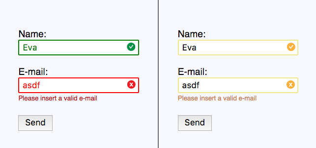
Let’s see how it works on my current website design for Power City where I use green ‘tick’ icon and informative text to communicate successful purchase (image below). I have not created payment form yet, however, at this point I know I should not rely on colours only.

2. Working with scale
Astigmatism affects between 30 and 60% of adults, however, blurry vision is the problem which affects people of all ages and nationalities. Therefore, we should consider the range of audience with vision problems.
There are many ways to overcome this problem. One of them is allowing the user to zoom the content. To allow that, you need to avoid disabling functionality code such as:
<meta name="viewport" content="width=device-width,initial-scale=1,maximum-scale=1">
Another way is to include big headings and clear call to actions. If you will have a look at my personal portfolio site, you can clearly see the big underlined headings. It is well designed when it comes to legibility, but not so well when it comes to the description underneath. The contract works quite well when it comes to aesthetics, however, if we want to include people with blurry vision, it is not the best practice.

Another feature which wasn’t well-designed is links. These big headings are in fact links, which display a particular image when hovering on, and bring the viewer into the project’s page when being clicked. This is the main issue which was also spotted by Conor. They don’t act as links.

When it comes to Power City website, I already included interactive links in prototype. As you can see on the image below, ‘Product’ become underlined when the user clicks on it.


However, there are way more interactive links I need to stylise before finalising the prototype. These include ‘Buy Now’, ‘Shop by category’ section where images act as links, and so on.


3. Working with images – alt attribute
The alt attribute is another web accessibility standard for people who can’t see well and use screen reader so it is important to use it in the code. It is compulsory to every image tag, however, even an empty tag is still valid. For example, if a picture is only decorative and doesn’t communicate anything we should still use alt=””. More than that, the function of an image as important as its meaning, therefore, if your logo links to your home page, you should include “home page” alt attribute instead of a logo, so the user knows where to click. Despite all of that, you also need to remember that alt attribute doesn’t only act as an accessibility feature. It is also very helpful for people with slow internet, which are also worth to consider!
Sometimes, instead of images, we may want to use SVG icons which can’t have alt attribute assigned to them. Luckily, SVG standard allows us to use <title> and <desc> tags for short and long descriptions. See the code below:
<symbol id="langIcon">
    <title>Language Icon</title>
    <desc>Longer description</desc>
    <path d="M0 2C6.47 2 2 6.48 2 12s4.47 10 9.99 0h24v24H0z" />
</symbol>
As I was running my portfolio link through W3C Validation Service, I got an error my images weren’t descriptive, so it is a good thing to remember when developing for Power City.

4. Add subtitles and captions to videos
This feature can be difficult to maintain, as not everyone knows how to generate videos with subtitles. As a graphic designer I know, that titles can be added to our videos in post-production software – Premiere Pro, Adobe After Effect and even QuickTime. However, there are few other ways you could use such as YouTube’s automatically generated captions. The other option can be embedding our video in HTML5 as it includes the <track> tag, with which you can easily attach as many subtitles and captions as you like using WebVTT format. Check the code below:
<video controls>
  <source src="movie.mp4" type="video/mp4">
  <track label="English Captions" kind="captions" srclang="eN" src="captions.vtt" default>
  <track label="Subtitulos en español" kind="captions" srclang="es" src="subs.vtt">
</video>
5. On hiding elements
If you want to hide elements from view but still let screen reader know they are there, use thevisually-hidden class in CSS code. This is particularly useful for skip-to-content links and form’s labels. Moreover, this code can be reusable so I encourage you to save it somewhere:
.visually-hidden {
    position: absolute !important;
    clip: rect(1px 1px 1px 1px); /* IE6, IE7 */
    clip: rect(1px, 1px, 1px, 1px);
    padding:0 !important;
    border:0 !important;
    height: 1px !important;
    width: 1px !important;
    overflow: hidden;
}
body:hover .visually-hidden a, body:hover .visually-hidden input, body:hover .visually-hidden button { display: none !important; }
As I have mentioned before, on my portfolio site I used code which displays pictures when hovering on project title. Back then I didn’t know about the importance of the above code. Although I know, an online portfolio is not a type of website which would be directed to people using a screen reader, however, it is a good thing to remember whenever developing a website for the wider public.
What is Angular, React and Vue, and how my websites can benefit from it?
I have search through many resources trying to understand more about Angular, React and Vue, than being the most popular JS Libraries. However, many of articles I have found were using very technical language which I couldn’t understand. I found a Youtube video, in which Max from Academind compares these 3 libraries together in very understandable way. You can find the video here.
Let’s start with React
- An extremely popular library which is used to build and render complex components (UI elements – ie. buttons, inputs) which you can drop into your web pages
- Has one implication which means it focuses on one or very few things,
- You work in JS only (you may also utilise JSX for working with HTML)
- Contains Router/State Management/Axios – React libraries which help to build more components
- Developed and maintained by Facebook
- Primarily used for web apps but can be used to build mobile apps with React Native (and Ionic 4 framework)
- Quite easy to learn for beginner developers
Key characteristics of Angular
- Extremely popular within large companies,
- Developed and maintained by Google
- It is not just about creating components but acts as a framework/platform of rich set of tools which help with developing modern web applications
- Developed by an Angular team so you don’t have to rely on third-party vendors
- Uses native Web APIs, HTML templates for the components and CSS,
- No JSX needed
- Uses typescript (which is a superset to JS) as a language instead of native JS
- Includes and provide Routing, State Management, Http etc. – helping scale or building a big app
- The Angular is just a huge PACKAGE of core features,
- Mainly used for web apps but can be used to build native mobile apps using Ionic or NativeScript
- Easy to start with as it uses HTML and CSS however, requires to learn TypeScript
- Requires complex projects’ setup
Few words about Vue
- It is like a child of Angular and Vue – include some of their features
- Popular within developers but not used by big companies
- It is a complete framework for building reactive, component-driven apps
- It has less package than Angular ie. no official foreign validation library
- Uses native Web APIs, HTML templates and CSS (similar to Angular especially from Syntax perspective)
- Routing and State Management has provided by a core team, other capabilities are provided by community “only”
- Developed and maintained by Evan You & a team – not backed up by a big company, therefore supported by contributions
- Mainly used for web apps but it can be used to build mobile apps with Ionic or NativeScript
- Because uses HTML and CSS doesn’t require complex project setup
How I can use any of them in my future project?
All of these libraries have quite unique features and because the Power City website I am developing is quite complex, I am confident that knowing a little bit about 3 of them can make my work a little bit easier. Going through many possibilities offered by React, Angular and Vue I found few of them which particularly got my attention.
PayPal Express Checkout made with Angular JS:

Power City is a big retailer, and as a part of my brand design, I need to present the company as trustful and reliable. I believe this feature could help me achieve that.
Components with React JS:
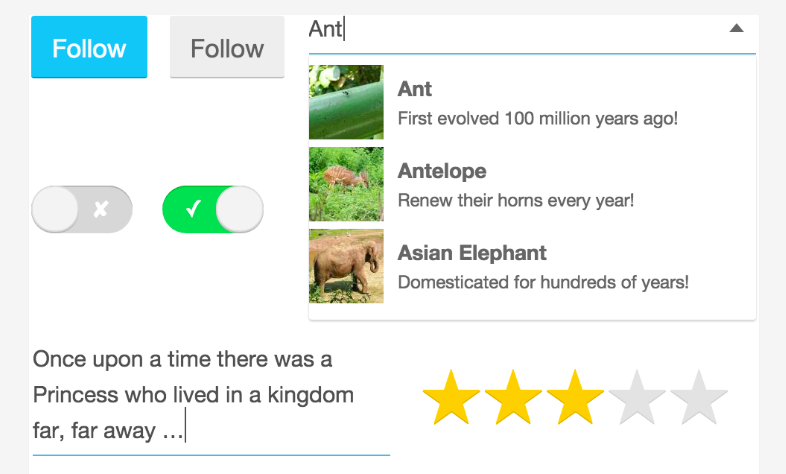
In my Power City website, I was also planning to implement components such as rating system and search tool. For this, I could use the React JS library.
When it comes to using these libraries with my portfolio website, I don’t think there could be a much of use, as it is a quite simple web. However, in the future, I could add rating system (thumbs up thumbs down) and search box if there will be a lot of projects added.
Critical Reflection
Old portfolio website
A year ago, when I was designing and developing my portfolio website, I have had no clue about web standards. Through such a short time I have learned many valuable lessons about UI and UX. Did I achieve what I wanted when designing my portfolio? There is no straight answer to this. When it comes to visualisation, I can say I am quite happy, although I know that there is much to be improved with usability and functionality:
- The website is not working properly on every device
- Major errors in the code such as negative margins
- Difficult to extinguish links
- Contact page brings you to an email app
- Inconsistency in design for desktop and mobile
Back then, I was focusing on myself, wanted to create just a beautiful website, however, I am sure, that with the knowledge I have right now, I can work on something better.
New Power City website
Based on what I have learned when writing this article, I know what kind of mistakes I have made in web accessibility and usability and I know, what I should pay attention to when developing a website, and designing rest of the pages for Power City’s new website.
- The website has to have a clear colour contrast to make it easier for colour-blind people
- The content should be displayed as simple as possible, so it can be read by the screen reader
- Avoid using hr tags to break content
- Do not only depend on colour to communicate the message, especially in forms
- Keep consistent (preferably em) sizing systems for different devices
- Do not forget about alt tag for your images
- Avoid negative margins as they destroy layout when browsing on a smaller device
- Visible links and clickable elements
- Simplicity, simplicity and once again – simplicity
 Welcome to Just Inspect